


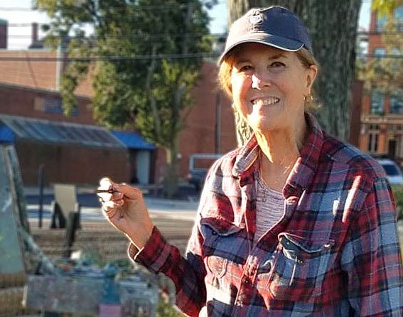
Dale Ratcliff, painter
Her favorite painting tips, the merits of being interestingly incorrect, gallery life, a very cute dog, and more

Dale Ratcliff loves a stirred-up sea and communicating that energy in her paintings using broad brush strokes. Her ocean scenes are dramatic looking. She was amused one time when a gallery visitor, upon seeing her depiction of churning seas, asked if she was an angry person. Actually, it’s quite the opposite.
Dale is not a risk-taker on the level of storm chasers. But she’s often been up close and personal with the ocean and been soaked while taking reference photos en plein air. These days, she’s inclined to paint during storms while seated in her water-resistant car with 8” x 10” panel propped up on the steering wheel.

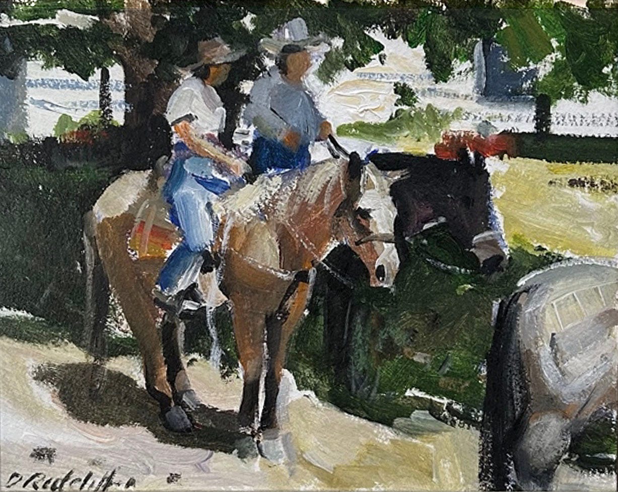
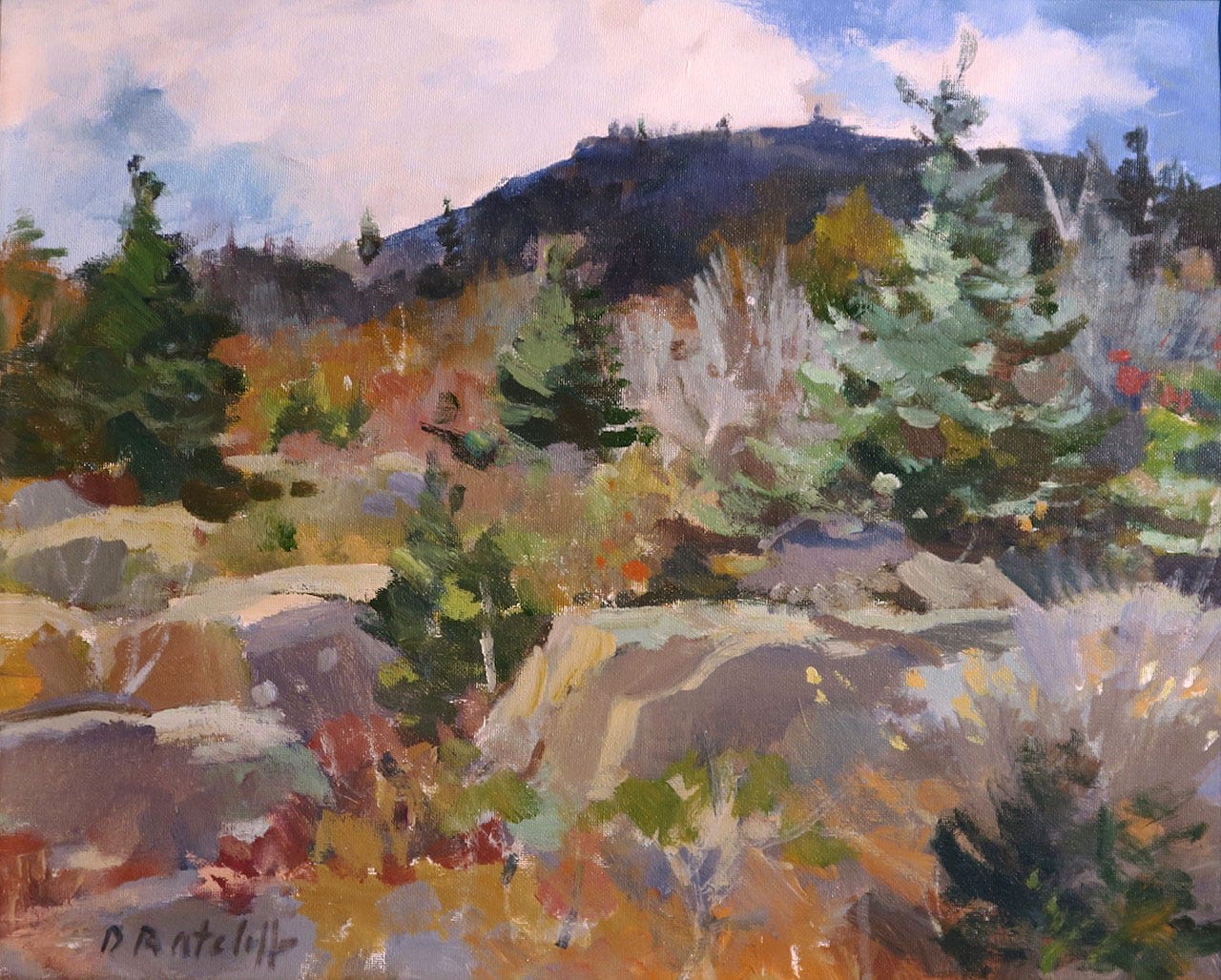
Dale is known for her award-winning dramatic ocean scenes. But she is also admired for her depictions of New England landscapes and harbor scenes. Her love for horses is also expressed in some paintings, such as this award-winning piece below.
Her Gloucester High School art teacher Howard Curtis, himself an accomplished marine painter, recognized Dale’s talent and drive and continued to mentor her after she graduated high school and college. For a couple years, Dale lived and painted in a small, summer cottage near Rockport’s Halibut Point that afforded a prime view of rough seas. She traded spectacular views and interesting scenes for living without heat, electricity, and running water. During this period of artistic inspiration and intermittent discomfort, she was painting as often as possible while also working at the venerable Gloucester Building Center as a cashier. This “real job” covered the costs of painting supplies and basic necessities. Dale augmented her income by accepting commissions to paint animal portraits.
Eventually, Dale moved on to more comfortable lodgings, succeeded as a painter and instructor, and spent more than 30 years as life partner and wife of prolific art writer and artist Charles Movalli, who had a stellar career and passed away in 2016. “Charlie” helped Dale progress as an artist and encouraged her to teach workshops, which she enjoyed. They traveled the world to paint and visit museums. Today, she nutures Movalli’s legacy by sharing his artistic principles with those who will listen and finding new homes for his paintings (in collaboration with Gallery Montanaro).
I first met Dale at a retrospective exhibit of her late husband’s work and appreciated how friendly and welcoming she was to me. The next time I saw Dale was June 2022 at the Stapleton Kearns Gallery in Rockport, MA. Dale and “Stape” had opened their gallery just three days prior, and my husband (aka staff photographer) and I were among their first visitors. I had a long list of questions for the painting couple, and my curiosity led to the first story posted on this site.
If you didn’t read that story, here’s some background on the other half of this painting power couple. Stapleton Kearns is a widely respected and collected landscape painter and teacher. Many years ago, as a way to address his frustration about the state of art education, he wrote more than 1,000 blog posts about painting techniques, art history, and much more. He did so with dry humor and deep knowledge of art history, particularly Cape Ann art history. Stape’s recent solo show at the Guild of Boston Artists, We Are Still in Eden, featured a remarkable collection of New England landscape scenes. I attended his associated painting demo during which he blocked-in his subject using a thin, purplish wash and then applied more opaque tones using his signature broken color technique. It was quite a demo and show.
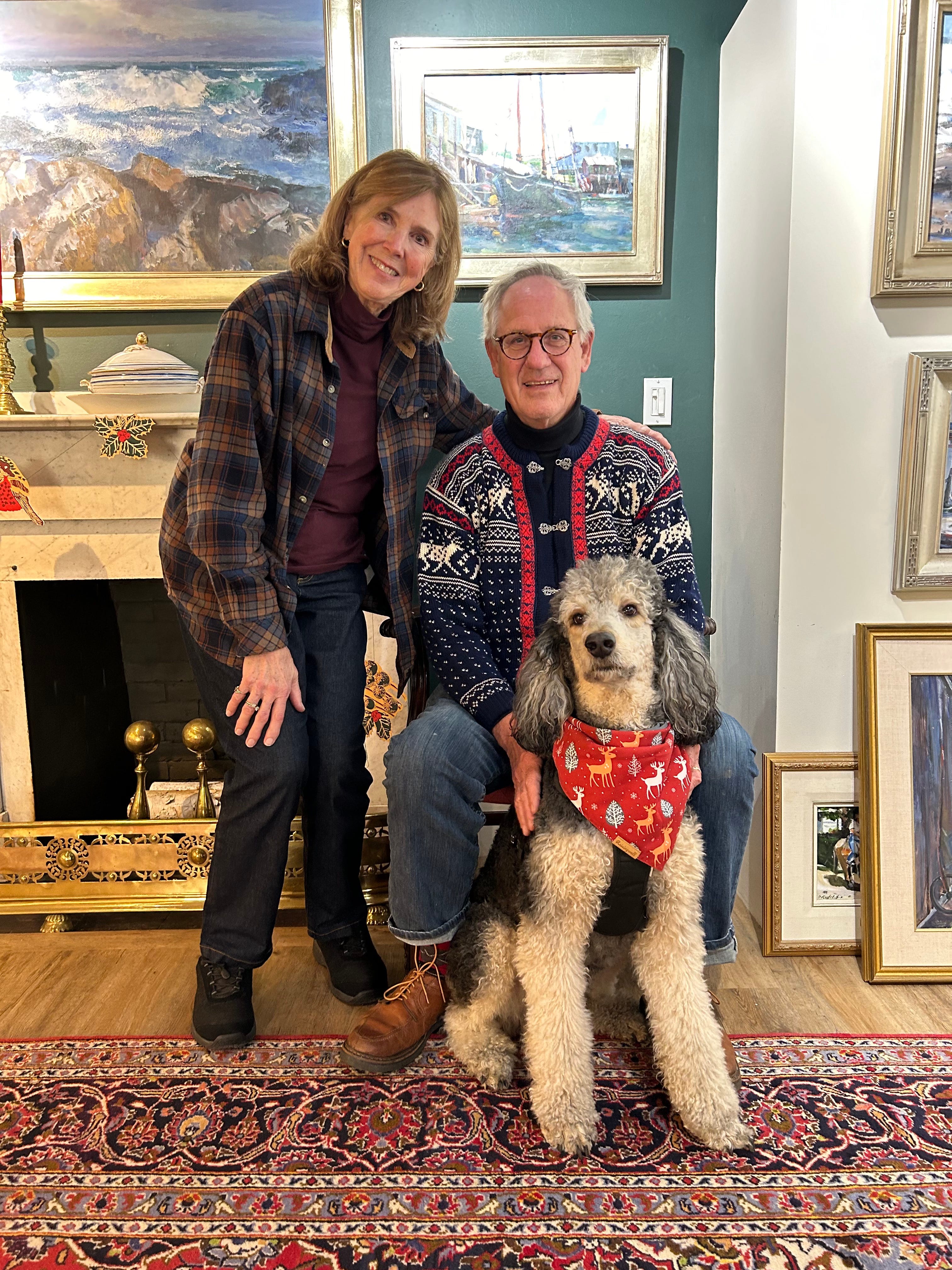
Since my initial interview with them, Dale and Stape were married in Jeffersonville, VT, one of their favorite painting destinations. They also moved their gallery about a hundred yards down the street to 20-B Main Street, where they can be found painting alongside their well-behaved and affectionate poodle Wyatt. I realized there was much more to Dale’s story, and so we spoke again.

You were encouraged to paint at a young age.
My grandmother used to take me into art galleries when I was eight, nine, 10 years old, to see paintings. She was instrumental in getting me to paint and paid for lessons from Joseph Jeswald, who founded the Montserrat College of Art. I took his plein air classes for children when I was 10. The first thing I ever painted was the Babson Museum, which is that little building you see as you come into Rockport.
The Gloucester school system had a very good art program. I won the Boston Globe Scholastic Art Awards contest two years in a row. I painted Siamese cats and Motif No. 1, which was funny because I painted it with gigantic seagulls. They looked like Tyrannosaurus Rexes up on top of the building!

How did you arrive at your style of painting?
I studied with Howard Curtis in high school and after college. At one point, some people said my work looked like his. I got to thinking, I'm not Howard. I want to do my own type of painting.
Around that time, Charlie [Movalli] came along. He was in my high school graduating class, so I knew him a little bit. He came into the Gloucester Building Center where I worked and said, "I want to interview you for American Artist Magazine." I told him to come back in a year. At the time, I was living in a cottage near Halibut Point, didn’t have much inventory, and was going through a divorce. He came back one year later to the day. He invited me to paint outside with him and some friends.

At that point, you were a studio painter. How did you adapt to painting outside?
When I was painting in the studio, I was inventing my marine paintings. I wasn't going to the source and studying waves and rocks. I was studying with Howard Curtis, who created a lot of allegorical type marine paintings with people gathering firewood and shipwrecks. I was bringing my imagination onto the canvas, which I think of as bringing my inside thoughts out.
When I started painting plein air as an adult, I was learning to see the colors outside and how to get the whole value system working; I was designing using the elements that were in front of me. So that's bringing the outside in. I allowed myself to be inventive and imaginative painting outside. I wasn't painting things that were in front of me. I was arranging things from different parts of the scene to make a beautiful design.
A lot of painters start out painting what’s in front of them. Well, that's not a painting. That information will help you, but the real painting comes when you put your own thoughts and ideas into a beautiful arrangement of the shapes and colors. Doing so takes an awful long time to develop. After about three years of painting outside, I started to get it.
Now I do both: bringing the inside out and bringing the outside in. Oftentimes, people look at my marine paintings and say, "Well, I know where you were standing when you painted this.” [Usually they don’t, she says.] I make little 8” x 10” paintings when I’m outside and I use those as tools for inventing the sea paintings, so they're based on reality, nature's reality.
Tell me about your saying, "No pattern, no painting."
You need a dark pattern to hold your painting together. You can see the dark pattern in my marine paintings and in any other subjects that I paint. It's sometimes very subtle, but everything's connected by the dark shadows.
I learned this eavesdropping at Charlie’s demonstrations. He would talk about design principles and connecting things together. He said, “Begin with a broom and end with a needle.” You begin with a very rough, expressive painting, and then you put in the important edges that are near your focal point so that the viewer knows where to look.

How do you determine how much of the “end with a needle” to do?
I use a line here and there on an edge to bring the attention to the focal point. You want to avoid making a “chamber of commerce” picture that has the same amount of detail across the whole painting, because then you end up going nowhere.
A painting is like an after-dinner speech. Franklin Roosevelt said, “Be sincere, be brief, be seated.” That's what a painting should feel like when you're creating it. Be truthful to the idea of the painting. Paint briefly and quickly, and then be seated, meaning don’t overwork your final needlework.
What are some other guiding principles you like?
Emphasize light-dark, warm-cool, and big-small. That oversimplifies what painting is, but if you keep those ideas in your head when you're working, you're using scale—big buildings, small buildings, a big beach, big rocks, small rocks—and can apply that to anything that you're painting.
When it comes to color, you have warm colors setting off cooler colors, so sometimes it’s good to use a warm color next to an object painted with a cool color. It takes a lot of practice to get those to work.
I'll never forget watching Charlie [Movalli] teach his workshops, and how he saw color. I thought he must have extra rods and cones in his eyes because I didn’t see the colors he did.
He would talk about how when we're in the first grade and we're given crayons, we color tree trunks brown, grass green, the sky blue. But it isn't like that at all because of what light does to those colors. The color from the sky makes the top part of the tree cooler, and reflected light from the ground up into the tree trunk makes the trunk warmer. As you paint more, you can start to see different colors.

Dale recalls that at one point, Charles determined she was ready to teach some of his workshops. He thought that solving problems for students would help her progress with her own painting. She led workshops for a few years, inspiring and educating many fledgling painters while also dealing with students with “interesting” personalities. At one workshop, Miss Florida showed up demanding to learn abstract painting despite the workshop being billed as a landscape painting event. Another time, a student urgently awoke Dale in the middle of the night to critique a painting. One of her students requested she join them on their morning jogs to have art chats (she declined). Dale laughs as she describes the demands on a traveling painting instructor.
How do you approach a marine painting?
I think about simplicity with my paintings. With marine subjects, they have to be either a sky painting, a rock painting, or a water painting. It can't be all three. Something has to dominate.
I don't want even measurements along the sides of the painting because that would make them static. I want directionals in the cracks in the rocks to be leading you into the subject, for instance. I want the waves to be contained in the frame and not going out toward someone else's painting, if it’s in a show.
I also want to get the character of the three elements, so for example, painting the rocks well. Howard Curtis used to varnish pieces of coal or rocks and play the light on them so that you could see the planes. He got the idea from Frederick Waugh.

Tell me a bit about painting water.
The water is reflecting the sky, and there are lots of colors in the surf, just like snow paintings. Surf paintings and snow paintings are very similar for me because of the colors that are in the whites. You see all the colors in Hibbard’s snow paintings: the purples, greens, pinks.
Stape teaches in his snowcamp painting events about what Hibbard said: that if you have a lot of pink in your snow, your sky's going to have a lot of green in it. Well, it's the same with the surf. If the sky is reflecting down and it's pink or greenish, then it's going to be the opposite in the water.
The most important thing with the water is to not draw it in a very precise way because that's when it becomes more like ice than water, and it doesn't move.
I use my whole arm and twist my wrist in different ways to create the effects of the small waves turning over and keep the motion going. There are little features that are created in the water, like these little circular things. Well, you might fall in love with those and start putting them all over the foreground water. But you have to keep it simple and maybe suggest one of those features here and there in a good place in the painting.

For instance, look at this painting [Splashover, above] showing the eternal battle of rocks and water. It won an award at the Rockport Art Association and Museum 2024 summer show. Now that I look at that, the sky could have been a little bit pinker. But all the colors in the surf as it moves and the shadows that one part creates as it turns over, this is a shadow from this big heavy thing that's coming over. And the greens, it isn't a solid green color. It also has foam running over the front of it.
I’m aiming for realism. I want the viewer to smell the salt spray, hear the crashing of the waves, and experience the energy in the brushwork, which is really the signature of the artist.
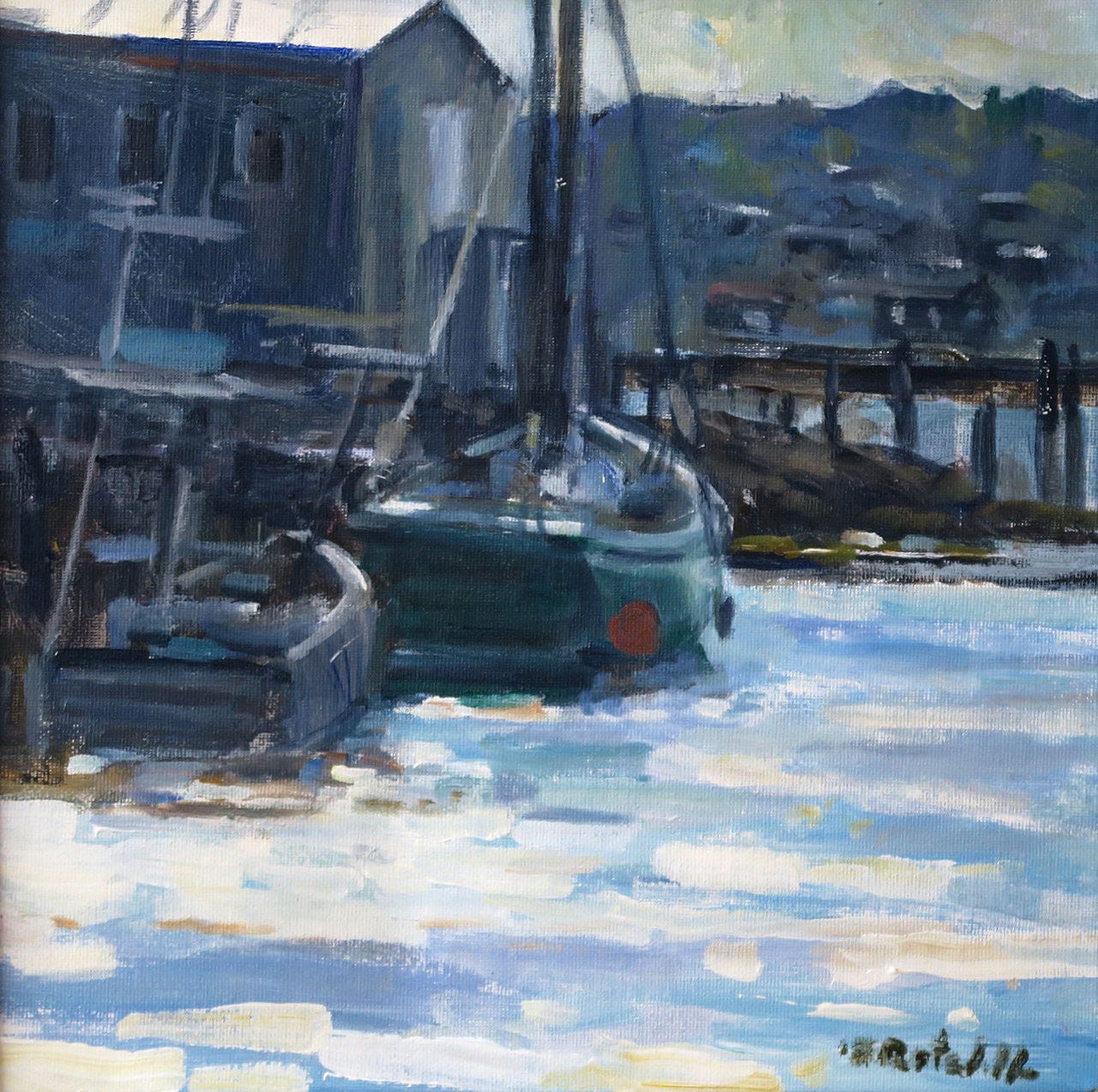
Tell me about the boat painting with the flag.

This painting [A Summer Day in Camden, above] was a lot of fun to do and it came out rather quickly. If you have all the detail, you get lost in the rigging, and you don't get into the general feeling of the picture, which is rattling shrouds and batting against the masts, and the action of all the little sailboats in the harbor. I think it's more fun for the observers to put the detail in with their minds than to see it. It's almost offensive to have everything explained to you when you look at a picture.
When we start a painting, we have the four straight lines of the canvas to deal with. And Carl Peters always said, "Play off those straight lines with more slanted lines that lead you into the painting." And so you can see with this painting, I've got things that are leading you into the boat. The flagpole is leading you in. Even the bow sprit could be leading you in. There's a reflection in the water that leads you in. That's so that the viewer stays within the picture.

Have you internalized these principles such that you are using them without thinking about them when you paint?
Most of the time. When I was working at this over the years, I would block in a painting with dark shapes and have the whole pattern idea figured out. Now, when I'm putting a seascape painting together, and this is the guidance from Carl Peters I just mentioned, I put in five diagonal lines, which are directionals that play off the straight lines of the frame. Those lines give the picture action, and power, and energy.

You say sometimes a painting can be interestingly incorrect or irritatingly correct. Explain.
Sometimes things that are perfectly drawn can be boring. The little eccentricities of a line or the way a roof is built can actually be more interesting.
That leads me to another principle. Perfection can be the enemy of great art. If everything is explained to the viewer, they get tired of looking at the picture. I find that with many of paintings we own. It’s stimulating to visit them repeatedly to study them; I often take away something new. I try to acquire paintings that have something I can learn from.
What’s an example? Do you have a favorite painting?
It’s a Frederick Waugh seascape painting. I learned about him through Howard Curtis. From that painting, I learned about freedom, and it gave me courage to be as bold as he was in his work.

Did the discipline you learned training and showing horses cross over into aspects of your painting?
Definitely. Both require setting your mind to a goal and following it through. I started applying to the art associations and didn't get in right away, but I kept at it. Also, with showing horses, my goal was to compete and do my best, but also to have fun and not take myself too seriously. That's advice that I would give to an art student. I would also tell a student to never lose a sense of wonder.
Gruppé always said he painted for his own amazement. He wanted to be surprised by his subject matter.


I was surprised to learn that you paint with acrylics and not oil.
I worked with oils for at least 10 years before I switched to acrylics. Howard [Curtis] gave me the three primary colors of acrylics because he was transitioning to acrylics. I tried them and liked them and have used them ever since.
[This discussion reminded her of the time that she accompanied Howard to accept an award at an Academic Artists Association event. He used acrylic paint to freshen up his shoes because he didn’t own a pair of dress up shoes. That was one of his many eccentricities, Dale recalls with amusement.]
Charlie was skeptical about my working in acrylics because he was a confirmed oil painter. Then, one time when he realized he wouldn’t be able to produce paintings that would dry in time for a show, I loaned him my palette. I heard him say, "I'm never going back," and he never did.
I don’t use the gimmicky stuff that give acrylics a certain look. I also work fast, furiously fast, because I like the look of the stroke and like to put it down and leave it. Also, I don’t have to worry about picking up a color from under it like I would with oil paint. The fast-drying quality of acrylics allows me to work quickly and expressively.
When working in the field, I keep my palette in the shade and have a spray bottle with water to keep my palette workable. When you are outside in the winter, you can add rubbing alcohol to the water so your paint doesn’t freeze.
Do you have a full picture in your head of what you want to create?
Sometimes. But then I go down the winding path into parts unknown. That's why I do small pictures outside without a lot of attention to composition. I want the information for my big paintings that I can set up in a comfortable studio atmosphere and work them out.
I always wonder how a couple of creative and driven people influence each other.
Charlie and I did not critique each other's work very much. He very often would say to me, "That needs a signature, doesn't it?" meaning the painting was finished. Or he would stick something over a spot that needed work.
I have learned a lot about patience from Stape because he's just so patient with himself and what he does. If I run into a stumbling block, I put the thing aside and I start something else. But he's relentless about pursuing the same problem until he resolves it. I’ve also learned from Stape to put more time into drawing and getting the perspective right.
You and Stapleton have had this gallery for about two and a half years. What has the experience been like for you?
It’s given me a deeper commitment to keep a painting schedule. [There’s a painting studio in back, and Dale and Stape paint there often.] It’s wonderful to be a part of the fabric of the Rockport art community and the enjoy the camaraderie of fellow painters.
What is it like for you to see people experiencing your art?
In the past, I would receive a check in the mail when a gallery sold one of my paintings. I would ask about the people who bought the painting and the dealer would say, I just sent one of your paintings down to Texas, or London, or something like that.
The most rewarding part of painting is experiencing the process. I want my paintings to look fresh and spontaneous and for the viewer to sense my enthusiasm for making them. It’s fun to see people respond to the work and then take it home, because that work has finally reached its purpose, which is to bring enjoyment to the viewer.
Palate & Palette menu
Here’s what I served when Dale and Stapleton came to dinner:
Socca
Mixed green salad with honeycrisp apples, goat cheese, toasted pecans, and fig-balsamic vinaigrette
Skillet chicken with mushrooms and caramelized onions
Parmesan millet with roasted broccoli
Apple and cinnamon torte
Where to find Dale Ratcliff
Stapleton Kearns Gallery, 20-B Main St., Rockport, MA
Bayview Gallery, 58 Maine St., Brunswick, ME
Rockport Art Association and Museum, 12 Main St, Rockport, MA
North Shore Arts Association, 11 Pirates Lane, Gloucester, MA
Facebook
If you liked this…
Show your appreciation by clicking the like heart button below—I’d love to know you enjoyed the story.
Forward this to a friend and encourage them to subscribe.
See more than 50 stories about art and food at palateandpalette.substack.com.
This was such an interesting morning read. I like Bathtime the most - so vivid! I feel like I'm there.
Thank you for such an indepth interview and the link to Stape's blog. If I had to pick a favorite painting it would be Arcadia. They are all lovely.