
Eric Jacobsen, painter
The life-changing mentor he never met, switching it up with the Gruppe palette, a deep dive into still life composition, and more


Painter Eric Jacobsen from Cushing, Maine, and I have a common bond. It’s not the ability to paint in the gutsy and loose manner he does so well. Nor is it spiky, rock n’ roll-ish hair, or an energetic demeanor at 9:00 a.m., which is when I conducted my interview with Eric. No, our common bond is a deep appreciation for the work of Charles Movalli.
Movalli was a prolific Cape Ann-based painter who took a loose, less-is-more approach to painting that makes his work recognizable from across a room. Sadly, he passed away in 2016, but he left the world with many wonderful paintings, a treasure trove of artist profiles, art instruction books, and even more positive impressions of the man.
I’ve studied many of Movalli’s interviews in the book, Conversations with Charles Movalli, to learn how he profiled painters in American Artist magazine and brought readers along with him on his studio visits. Reading these pieces taught me so much about storytelling and provided me with useful lessons for writing about art. Interviewing him for this site would have been a real “get,” but Palate & Palette came along well after he passed. I’ve only met him through his videos. More recently, I interviewed his widow, Dale Ratcliff, a painter in her own right who has her own style but has also taught his approaches.
Now, let’s get back to talking about Eric. He is a Movalli aficionado and devoted fan. Eric enthusiastically teaches many of Movalli’s techniques and philosophies—with Dale’s blessing—and reflects them in his paintings, while doing his own thing. Much to my surprise, Eric didn’t meet Movalli either. “When I would come back ‘home’ to New England where my family lives, I always wanted to meet him, but I was too nervous to ever approach him, and then he passed away,” Eric said. “The way that I learned from him wasn’t a direct mentor-student situation in real time. I was influenced by him through looking at his work, reading his books, and then later, meeting Dale Ratcliff.”
Eric studied at the Lyme Academy of Fine Arts, Old Lyme, CT. Since then, he’s won numerous awards for his still life and plein air paintings. He also teaches workshops and offers an online mentorship course through Tucson Art Academy Online. Here’s our January 2026 chat.

Tell me about your first art lessons.
I took my first drawing and painting classes while majoring in History at Gordon College, north of Boston. Bruce Herman was my first art teacher and became my mentor. I loved going to his studio where everything in the room was purposeful. It wasn’t set up to look cool and artsy, but it seemed that way to me.
I fell in love with the materials, the smells, the coffee cans full of brushes. I liked that these things were tools with a purpose. I began painting and didn’t know what I was doing at the time, but I liked the experience.
What led you to study at Lyme Academy of Fine Arts?
Those initial art classes in college got me interested in the world of drawing and painting. My mentor Bruce Herman encouraged to pursue a more strict and regimented study and suggested I meet and talk with the renowned sculptor Walker Hancock, who lived and worked at his home and studio on Cape Ann in Lanesville. I rang him up and he agreed to meet with me. We had several meetings, and he told me the only school he would recommend for formal training in the fine arts was the school run by the great Elisabeth Gordon Chandler—also a renowned sculptor—called the Lyme Academy of Fine Arts in Old Lyme, CT.
Long story short, I visited the school and was absolutely stunned by the quality of work I saw there. The student work was at a level I’d never seen before. I nervously and excitedly applied and was accepted into the school. So that’s when I began my formal drawing, painting, and sculpting training. I spent three years at the Lyme Academy and upon graduating I was awarded the John Stobart Fellowship, which granted me a yearly stipend and a solo show at the academy the following year. The show was a wonderful success, thanks to all the folks who supported me and bought my work at the exhibition.
I saw your painting demo at the American Impressionist Society meeting in Rockport during which you and Dale Ratcliff were exchanging “Charlie Movalli-isms.” What are your favorites?
Charlie said, “Plan your work and work your plan.” What he meant was don’t just show up at your easel and expect the painting to just happen. Have a plan. That doesn’t mean you need to write out pages of notes. As an example, if I’m standing in a harbor, maybe I’m interested in the big hulking shape of this ship. I want the viewer to feel this big dark shape of this ship, without focusing on the details around it. That’s my plan.
Another favorite is “Understate, overstate, and never tell the truth.” Following this advice might work on a first date but then tank on later dates [Eric smiles]. But in painting, the idea is to make a little bit more of something—accentuating.
Tell me more.
Let’s say you’re painting a sunset and there’s a beautiful orange sky. Maybe you want to exaggerate the orange because it’s not as brilliant on the horizon as it could be. Or you are painting beautiful yellow roses that are up against someone’s bright yellow house. You might tone down the yellow on the house, understating it so the emphasis is on the flowers, rather than both the flowers and the house.

You said Charlie Movalli was among your top three influences. Who are the other two?
Sergei Bongart and Fedor Zakharov. They both painted probably exclusively from life, meaning not from photos, and that’s what I like to do. Like Charlie Movalli, both of them were very loose, expressive painters.
As I was learning to paint, I started off making a lot of tight drawings. Then I attended the Lyme Academy of Fine Arts, where I studied more academic figure painting, sculpture, and drawing. At some point, I got turned on to a number of Russian and Ukrainian painters.
Sergei Bongart placed less emphasis on the drawing and more on use of color and creating a feeling. That resonated with me and led me to paint quickly and try to paint as accurately as I could from a shape, value, and temperature standpoint, but not worry about the details.
That seemed to fit my personality. When I first saw Sergei’s paintings, I thought, “This stuff looks a little too slap dash.” I didn’t quite get it because of my naivete, but then as I grew, I kept revisiting his work and reached a point when I thought, “Oh, I’m understanding more now about what and why he’s painting that way.”
You have a video, “The Hardest Thing to Do is Simplify.” Why is simplifying a good idea?
Simplifying is important because we view the world at-a-glance, at least most of the time. Let’s say you are at a friend’s house and go into their kitchen to get a glass of water. You notice a bowl of pomegranates on the table. You might say to your friend, “Those are beautiful pomegranates on the table. I just love the way they look.” You didn’t stare at them and study all their details. What you saw was shapes, value, color, and relationships. That’s usually how we recognize things, not by the nitty gritty details. As a painter, you are a storyteller, and you need to figure out what to keep in and what to leave out.
Charles Hawthorne, the great New England painter who started the Cape School of Art in Provincetown, MA, used to say, “Painting is just like making an after-dinner speech. If you want to be remembered, say one thing and stop.”

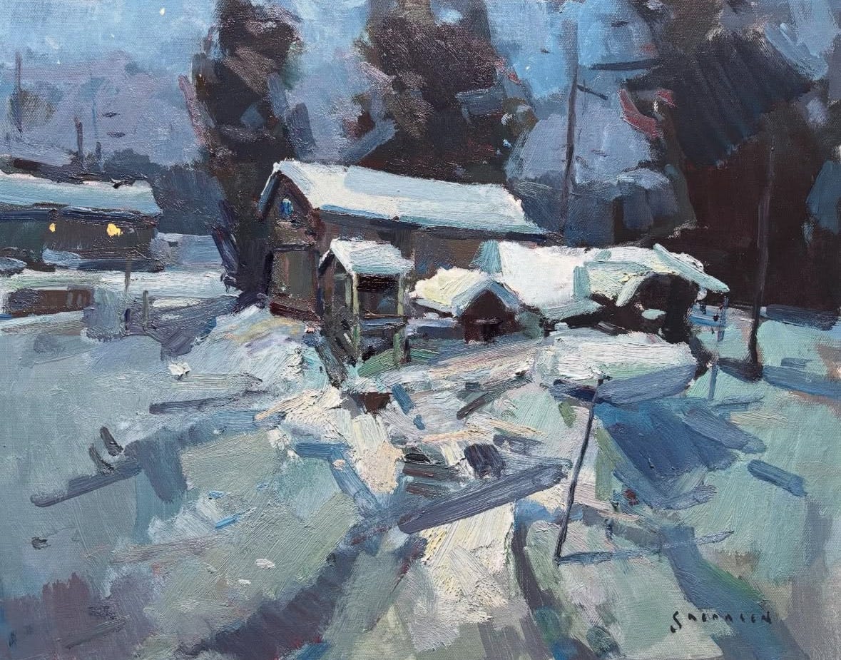
Your still lifes have such an energy and sense of delight to them. What are some aspects of a successful still life painting?
Well, thank you. I think about the movement of the eye through the painting with stopping points, which I’ll call a focal point or focal area. Recently when I taught my online students about focal point, I explained that it’s not necessarily one point, as in a single grape or a single house. Sometimes it’s a village in the background, for example, or an area where you want to draw the viewer’s eye.
The same concept applies to a still life. The idea is to create a composition with a main focal area and then place other points around it that are secondary so the eye can move through the painting.

You probably work that way intuitively, but can you explain how you create such pathways when you are composing a painting?
Yes. It’s somewhat intuitive for me, but in the beginning of the painting, I’m thinking about angles and radiating lines. For a still life, for example, very often there’s a tablecloth or even two tablecloths, one in the background and one in the foreground, and each is a different color. The edges of the tablecloths are angled lines that draw your eye to the vase and the flowers, which is where I want the eye to go. That’s intentional. From the beginning, I’m planning the design and arranging the objects so the eye will naturally follow that edge of one tablecloth against the table or another tablecloth.

The great Cape Ann painter, Carl Peters, was all about simplifying. Charlie [Movalli] talked about him in some of his videos. He recalled Carl Peters walking up to his painting and saying, “No” and then describing four radiating lines, or leading lines, that could serve as the framework for Charlie’s painting. Charlie, in his great way of telling the story, explained how he had been focused on the wrong things, and how Carl’s instruction helped him understand that the initial design and those lines that lead you into the subject were the most important part of the painting.
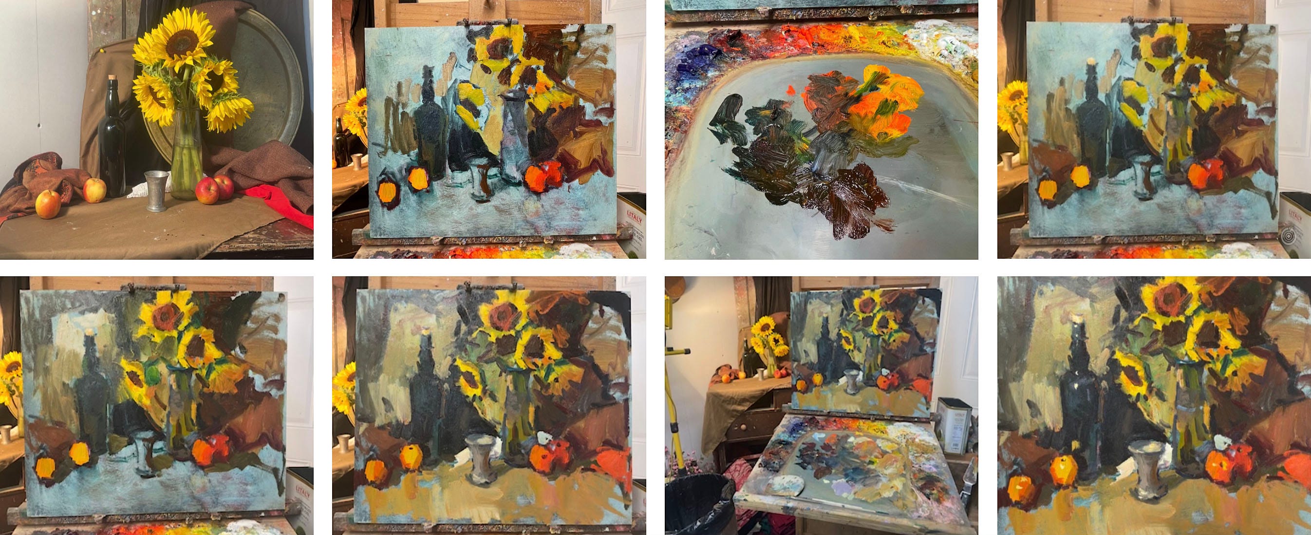
Your Still Life with Apple Blossoms painting was in the recent Rockport Art Association & Museum National Show. What makes that painting work from a compositional standpoint?

In this piece, I am most interested the flowers, but notice the little counterbalance below them with the small yellow vase and the light-colored petals on the table [Eric makes a circular motion to show that these counterbalance elements are in a circle]. Also, I’m placing light objects against dark ones: the small yellow vase and lemons against the darker wood table, and the white flowers against the red vessel and blue background. The great Maine painter, George Carpenter, another one of my favorites, said that painting is simple: It’s just light against dark and dark against light.
Regarding the design, notice the angle of the green cloth. The top edge of the red cloth is also at an angle. The lines of the two pieces of cloth are radiating out from the vase holding the flowers. Also, the edge of the table on the left side of the painting leads you into the painting a bit. Instead of the table going straight across the left side, that angle adds a little more interest with an unexpected little shape—the blue green wedge—for the eye to enjoy.
[At this point, Eric’s cat Arthur Herbert Fonzarelli saunters into view. Apparently, “the Fonz” hangs out in the studio and leaves wet paint alone.]

Another important aspect of composing a still life is to overlap objects. This “locks” the painting together and gives it a sense of depth. That’s why the lemons are in front of the vase that’s in front of the basket.
One more thing—Notice the little petals on the table. Why would they be there? Well, this is a big, flat, dark area, and we can activate it by adding those small elements. Also, the petals create what’s known as an implied line that the eye follows toward the flowers.
Do you ever try experiments to learn something new or break out of a rut?
Yes. Recently, I decided to start using the Gruppe palette [A limited set of colors: ultramarine blue, rose madder deep, cadmium red deep, cadmium orange, cadmium yellow deep, cadmium lemon, phthalo blue, and zinc white.]
Generally, I’ve used a palette with a lot of colors, but I’ve been using the Gruppe palette quite a lot lately, and I’m determined to stay with it because I want to grow and I think it produces great results.
I’m excited about having removed a bunch of colors from my landscape palette for the time being. There’s no right or wrong, right?


What colors are on your usual, larger palette?
My full palette is titanium white, lemon yellow, cadmium lemon yellow, cadmium yellow deep, cadmium orange, cadmium red light, cadmium red medium, alizarin, manganese violet, ultramarine blue, phthalo blue, viridian, phthalo green, burnt sienna, burnt umber, yellow ochre, and Payne’s gray, which for all intents and purposes is a black but has a bluish tone.
Switching topics here. You’re a musician. Does painting and your music playing cross-pollinate?
Playing music and painting are like going between two worlds, and playing music clears my mind in a sense. [His amps, bass, and guitars are set up in his painting studio.]
My family members all play music, so we have “Monday Night Music Night” and another night we play with a bunch of people in a town nearby. My son’s a drummer and he also plays guitar and keyboard. My daughter, who still lives at home, plays fiddle and mandolin. My other daughter plays guitar and keyboard. My wife plays guitar and I play bass and guitar. We have a lot of fun playing together.

Lightning round
What’s been your most captivating art viewing experience?
The most impressive thing was when Dale Ratcliff first invited me to her house to see Charlie’s studio. That meant so much to me. Everywhere I looked there was a beautiful thing, an object that he collected or a beautiful painting or a sketch. I’ll never forget that. Being there gave me a special feeling—a sense of connection.
What’s your favorite piece of art that you own?
It’s a Charlie Movalli painting I have right over here.

Have you created a painting that you won’t sell?
I have a couple that I’ve earmarked for my children. One of them is a large painting that I made when the kids were little and we lived in Washington State way out in the boonies. When I see it, it brings back all those feelings of my kids being young and all of us running around.

What have I not asked you about?
Let’s talk about gardening! We do a lot of gardening here, mostly flowers. My wife’s really kind, planting a lot of flowers and vegetables that she knows that I can harvest and include in my still life paintings. Last year, she planted many things including squash and pumpkins and onions. I like to depict onions when they have the tops on them, and it’s difficult to find places that sell them like that.

Are you reading anything good?
Yes! I’m reading The Painted Word by Tom Wolfe and I just got Brian Eno’s little book, What Art Does: An Unfinished Theory. I’m excited about it because he’s a deep thinker and such an interesting person. I also like to reread books by Nathaniel Hawthorne.

Where to find Eric Jacobsen
Palate & Palette menu
Here’s what I would serve if Eric and his wife came to dinner, which they are invited to do:
Winter citrus salad with blood oranges, grapefruit, red onion, and green olives
Peanut sesame noodles
Crispy lemony broccoli
Maine blueberry pie


Thank you for the interview with Eric Jacobsen. I live nearby and have been fortunate to study with him. Apart from being a great teacher and painter, he is one of the kindest people I know. Thank you for sharing his teachings and and his work.
Great interview with Eric Jacobsen. His trajectory is interesting and it is exciting to see who he has studied. Charlie Movalli and Dale Ratcliffe are important artists in our community!